#05 - Colour Mapping Tiles
After taking a holiday to see some family, I've come back to this project rejuvenated, filled with fresh ideas and inspiration on how to develop some of the core mechanics of this game. Since I'm still working on the terrain generation, I figured I'd revisit it to work out some of the ways it can be improved, and implement new techniques I've come up with to create a more dynamic and interesting visual style.
Although there is still a lot of code I want to refactor and tinker with, namely the current method of determining biomes, which currently uses temperature and precipitation values generated by perlin noise to lookup biomes with a min/max for each in a custom registry, towards a more scalable and dynamic approach, I thought I'd take a look at the tile and texture system I have in place first. As an art graduate, visual style is very important to me and I've spent an admittedly excessive time playing with pixel art I'm nowhere near ready to use, but the need for actual tile sets is quickly approaching so I've made some decisions.
Previously, I was using a custom set of stand-in tiles as representatives for biomes just to get an idea of the terrain generation, but my mind has been plagued with the achievability of my desired style, particularly for the grass. I wanted smooth transitions between biomes, so I took yet another page from Minecraft's book and went grayscale.
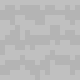
By making a grayscale texture for grass, I can use Unity's native tile colouring to tint the tiles and create really lovely smooth transitions between biomes without making an excessive amount of sprites and tile sets. This also means I only have to make one grass tile set, and any other tile sets down the line, I can implement the same logic. It cuts down on work dramatically and allows me to focus on the colours.
Speaking of the colours, I initially considered using a sort of colour point system, with biomes possessing particular colours in their data and then interpolating between these colours in code, but I'm a fan of full creative control, so I elected for a UV-esque style approach. I manually created a colour map in Aseprite which coordinates with the existing biomes which I plotted out on a table. I kept key colours I want to use and then created gradients between them to create the following image file.
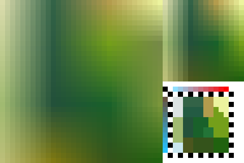
Because I used temperature and precipitation as a reference for the axes of this colour map, I'm able to reuse the perlin values that determine the biomes for individual tiles during world generation. Although I am eager to adjust the colour map and develop the colour theory along with the world generation and biome distribution (it leans a little too heavy on cold biomes), along with future adjustments for scalability, I am really happy with the results.
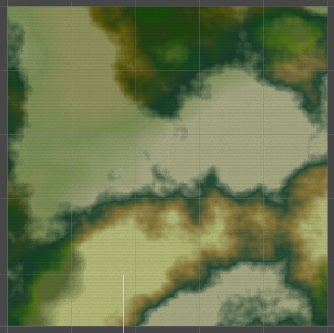
As opposed to the previous world gen using stand-in tiles, the gradients between the biomes are much nicer and actually resemble semi-realistic terrain. Keep in mind as well that this is a very scaled out view, being 500 by 500 tiles. It's far from done though. Although the colouring is nice, you still have the hard edges of the tiles themselves, whereas I want the gradient to be a bit more immersed in the texturing itself. So the next steps are to create a shader which will work alongside a grass texture and a script that will check neighbouring tiles and their tint, and adjust the tint of the texture colours by key appropriately. I made a quick texture to try and demonstrate this idea.
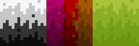
On the left is the grayscale grass texture I'm using at the moment (far from final), and the right is the same texture but split into 12 different colours. Using a shader and some code, I can recolour these colours, as you would a green screen, to corelate with the appropriate biome transition. It also means I can add a bit of shading and more detail to give the grass some volume. Being split by colour and shade vertically and horizontally respectively means I can use this technique in all 4 directions, essentially creating my own rule tile for colour transitions.
Following some further experimentation though, I've found the balance of tiling and even colour distribution across both axes to be a challenge. I create a demo tile and a 4 tile grayscale test to see how the gradient would work. Since many of the colours would overlap, and I want to maintain some texture, I use alternating shades to keep a checkerboard pattern.
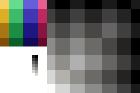
Since the bottom will loop to the top of the tile, the middle is weighted to justify for the doubling edges. Once applied to a 2x2 grid, you can see a nice smooth gradient across both axes. It is not perfectly even, given that it's essentially 16 pixels being divided by 3, but the larger blocks can work to disguise the edges of the tiles. I applied some texture to this concept and followed through with the same 2x2 example with the following result:
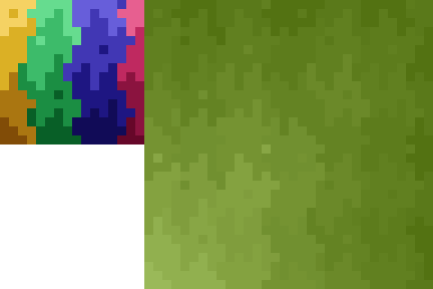
Here you can see that, despite being 4 versions of the same tile, the gradient colour and the texture creates an illusion of randomness. Repeated patterns in tile textures is a bit of a pet peeve of mine, so being able to achieve this and prove the concept valid has been a great pleasure. There are still more things I'd like to try out, particular in edge cases, but as an alternative to hard edges on biomes, I am more than happy with this approach.
But now the hard part, actually implementing this in code. I have a few ideas, such as simple running through the pixels of the texture map and essentially redrawing the tile from scratch, but this is bound to be computationally expensive. I considered shaders, and although I've used colour replacement shaders before, using a shader for each tile seems an expensive solution as well, though it's one I'll likely explore. I have some other ideas on how to solve this problem that need fleshing out, but if it's not fast and effective, then it's not suitable. I often wonder if I should just lower my expectations, seeing as my ambition often outweighs my capabilities, but there's no better way to learn! Plus I've come this far.
It also occurs to me that I will need to expand the world generation beyond what is rendered so as to generate tiles on the renderers edge that still align with the colour mapping rules, otherwise I'll end up with harsh lines at chunk border on generation because it'll only take into account the neighbouring tiles that actually exist. This seems like a simple thing to do, but seeing as world generation is so tightly linked with the rendering, it might require some heavy refactoring.
At least now I have a direction though. I've been lost on how the tiles will work since the beginning, and now I have a concept that I can pursue, however difficult it may prove to be.
None of this is final of course, and I still have a lot more to do and work out, but the foundations are there, the colour tint process works and all I need to do with it is tweak, improve, build, and tweak some more.
But that's it for now. Until the next time, take care.
Khôra
A top down 2.5D pixel survival sandbox & eco-sim.
| Status | In development |
| Author | Dormarr |
| Genre | Simulation, Survival |
| Tags | 2D, Indie, Open Source, Open World, Pixel Art, Sandbox |
More posts
- #06 - Terrain TexturingOct 09, 2024
- #04 - Natural FeaturesSep 07, 2024
- #03 - Expanding BiomesSep 02, 2024
- #02 - Prelim ArtworkAug 30, 2024
- #01 - World Generation FoundationAug 30, 2024
- #00 - Initial Ideas & ConceptsAug 30, 2024

Leave a comment
Log in with itch.io to leave a comment.